
Home › Cursive Alphabet › Cursive Z
Cursive Z: How to Write the Letter Z in Cursive
Capital cursive Z is a tall, rounded shape like the number 2 with a loop at the bottom, and lowercase cursive z is a small arch that drops into a loop below the line. Learn both forms below, then practice them in Z words and names.
Cursive script is a style of handwriting in which the letters of a word are joined together, and cursive Z is the last letter of the alphabet and the rarest letter in everyday English. It shows up in names like Zara and Zachary, in words like zebra and zipper, and in lively words like jazz and buzz, but it gets less daily repetition than a, e, or t. This page uses the D’Nealian form on the worksheet below.
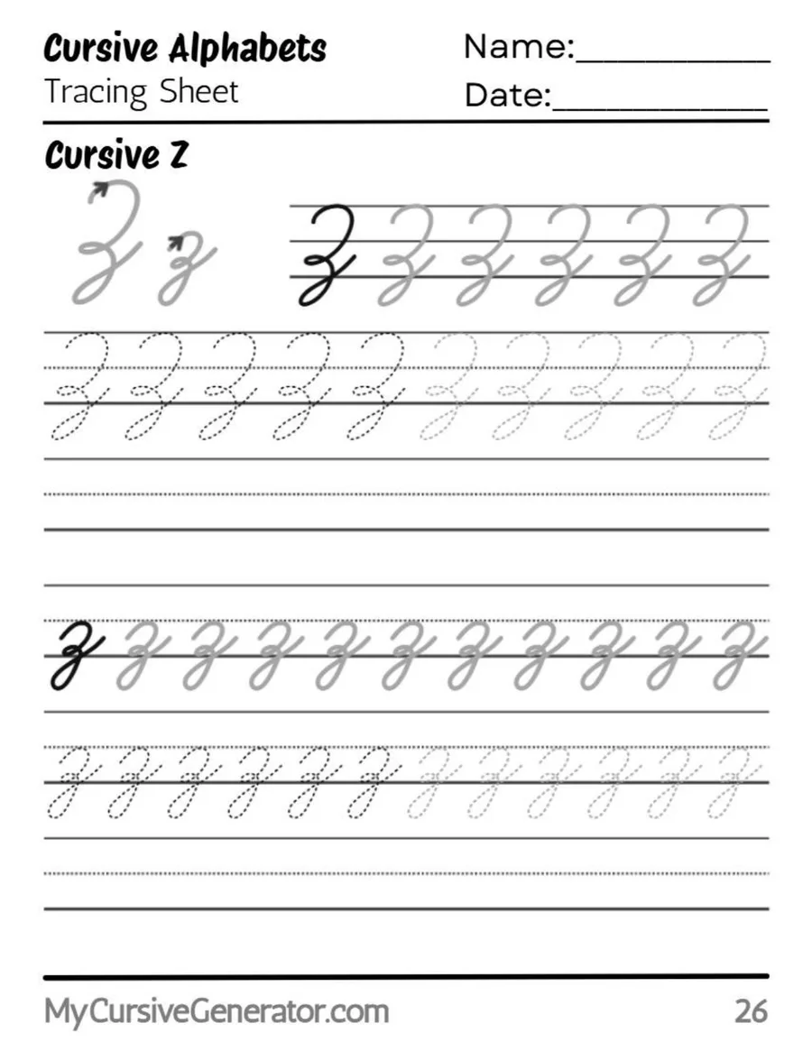
Trace the Cursive Letter Z
Trace the worksheet first, before you try to write cursive Z from memory. Trace the tall capital slowly, and notice where the top curve turns into the diagonal. Then trace the small lowercase form, and notice where the stroke crosses the baseline and drops into the loop below it.
Use short rows: one traced row, one copied row, then compare. If the copied row drifts, trace one more row.
Before You Start
You need four lines in mind for cursive Z: the top line, the midline, the baseline, and the descender line below the baseline. The capital lives between the top line and the baseline. The lowercase arch lives between the midline and the baseline, and only its loop goes below it, to the descender line.
Sit with both feet flat and tilt the paper slightly so your writing leans gently to the right. Hold the pencil loosely, about two finger widths above the tip, because a tight grip makes the diagonal of cursive Z jagged. Left-handed writers should tilt the paper the other way and keep the hand below the line being written, so the fresh loop stays visible.
Cursive Z at a Glance
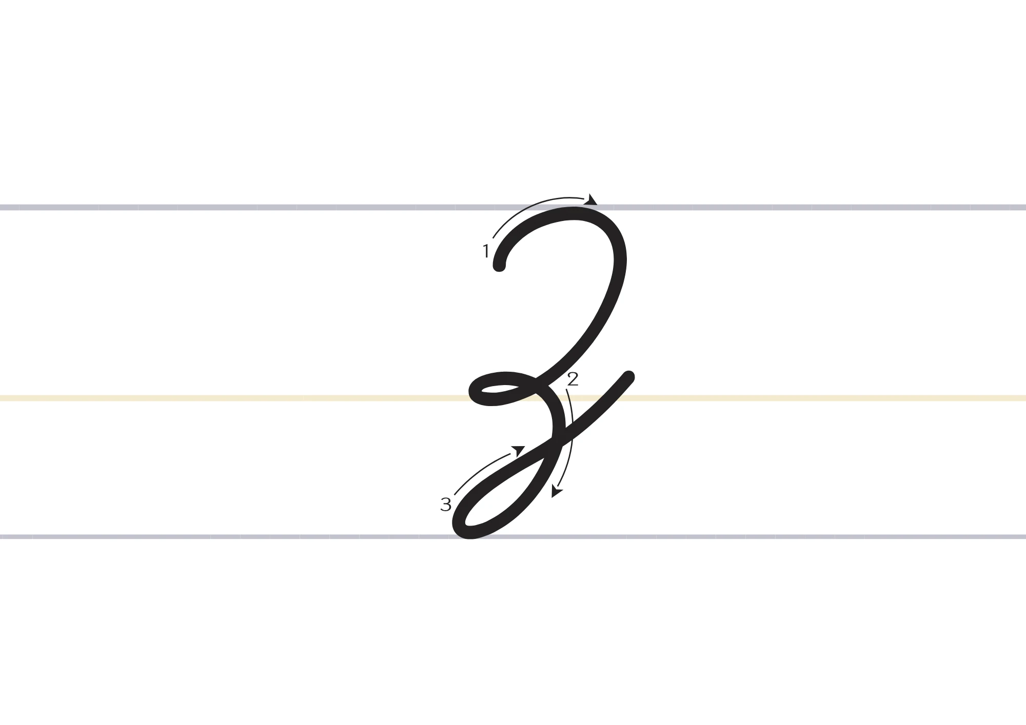
Capital cursive Z is one continuous stroke: it starts just below the top line, swings up to it, curves right and down like a 2, loops at the middle, sweeps down to the baseline, loops again, and rises to the right.
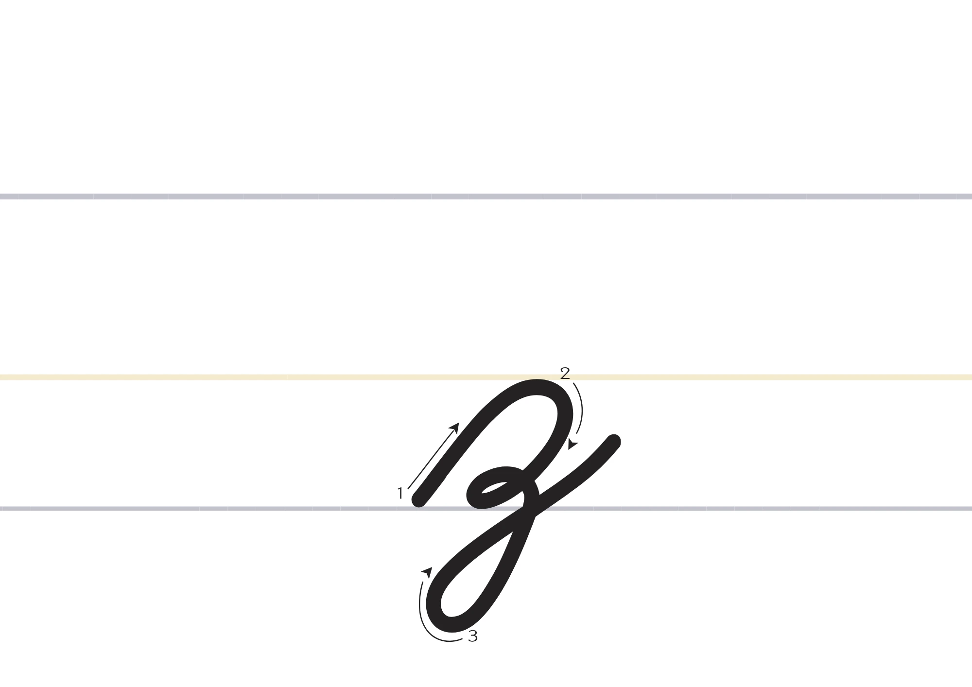
Lowercase cursive z is also one continuous stroke, but much smaller. It starts at the baseline, rises to the midline, curves back down, makes a small tight loop on the baseline, then drops into a wide loop below it before rising to join the next letter.
How to Write Capital Cursive Z
Write the capital in one continuous stroke, in three phases. Do not lift the pen between phases.
Curve Like a 2
Start just below the top line, swing up to touch the top line, then curve to the right and down in a rounded shape like the number 2. Keep the curve open, and do not draw a flat top bar like print Z.
Loop and Sweep Down
Without lifting, loop to the left at the midline, crossing over your own stroke, then sweep diagonally down to the left until you reach the baseline. This diagonal is the spine of the letter, curved at both ends so it joins the loops smoothly.
Loop and Rise to Join
At the baseline, curve around into a loop that touches the baseline at its lowest point, then sweep up to the right in a rising stroke. That rising stroke is the true ending of capital cursive Z. It leaves at about mid height, ready for the next letter.
Why Capital Z Looks Like a 2, and Why That Helps
Many learners worry when capital cursive Z looks like the number 2. In the D’Nealian form, that is correct, not a mistake. The top really is a rounded 2 shape, and the difference comes from what happens after it: the midline loop, the lower loop, and the rising exit stroke. A plain 2 has none of those, so if your capital looks like a bare 2, you have stopped too early.
How to Write Lowercase Cursive Z
Write the lowercase form in one continuous stroke as well, in three phases. It is small, so slow down. Written at full speed too early, it ends up too wide, too flat, or missing its baseline loop.
Rise in a Slanting Arch
Start on the baseline and sweep up to the right in a slanting curve until you touch the midline, then curve back down toward the baseline. Keep this arch narrow and below the midline. An arch above the midline looks like a tall letter, and one too wide looks like a v with a tail.
Make the Small Baseline Loop
When you reach the baseline, make a small tight loop to the left, crossing over your own downstroke, and come back to the baseline. This little knot is the fingerprint of lowercase cursive z. It keeps the letter from looking like a plain arch and sets up the dive below the line. Do not make it large, or it eats the space the descender loop needs.
Drop Into the Descender Loop
From the baseline loop, dive straight down below the baseline to the descender line, curve to the left and around, and come back up across the baseline, rising to the right as the joining stroke. The loop should be wide and open, as deep below the baseline as the arch is tall above it, crossing the baseline once on the way up.
The Lowercase z Descender Loop: Size, Depth, and Where It Crosses
Check depth, width, and crossing. The loop should reach the descender line, not stop halfway, and be open enough to see daylight inside it, not a thin spike. The upstroke should cross right at the baseline: a high crossing lifts the word, and a low crossing drags it down.
D’Nealian or Zaner-Bloser: Pick One Z and Stick With It
School styles differ visibly on Z. In the D’Nealian form used on this page, the lowercase top is a rounded arch with a small baseline loop, and the capital is a rounded 2 shape with loops. In Zaner-Bloser, the lowercase form often looks closer to a printed z with a descending loop added, and the capital is more angular, closer to two horizontals joined by a diagonal.
Both are standard, but do not mix them in one word or assignment. Mixing a D’Nealian arch with a Zaner-Bloser printed top makes the same letter appear to change shape. If your teacher model differs, follow it for that assignment.
How to Write Cursive Z: 10-Minute Daily Practice Routine
A short daily routine beats one long session. Ten focused minutes a day, for a week, is enough to make cursive Z feel natural. Use a lined notebook with a descender line.
- Warm-up arches (2 minutes): draw the lowercase arch and the capital top curve, keeping every arch the same height and slant.
- Capital form (2 minutes): write five capitals slowly, checking that the 2 curve, both loops, and the rising exit are all present.
- Lowercase form (3 minutes): write rows of lowercase cursive z, all the same size, each with the small baseline loop and a full descender loop.
- Words (2 minutes): write zebra, zoo, jazz, and buzz slowly, without lifting the pen inside a word.
- Quick check (1 minute): compare your last row with your first. Are the heights the same? Is the slant steady? Does every loop cross at the baseline?
Repeat it tomorrow. The goal is not a perfect page on day one, it is a steadier hand by the end of the week.
Words That Start With Z in Cursive
Practice these common Z words. Read them, trace them, then write them on your own:
Zebra · Zoo · Zipper · Zucchini · Zigzag · Zero · Zone · Zoom
Zara · Zain · Zoe · Zachary · Zoya · Zaid · Zelda · Zane
Z Words Inside Words: Where Lowercase z Hides
Most lowercase z letters hide inside a word, so practice those too: lazy, hazy, maze, amazing, breeze, freeze, puzzle, dazzle, jazz, buzz, fizz, and size. These are harder than zebra and zoo, because the letter before z sets the entry height and the letter after z must be reached from the bottom of a loop.
See these words in copyable cursive text with our cursive generator, or go back to the full cursive alphabet chart.
Common Mistakes With Cursive Z
- Drawing cursive Z like a printed Z. Print Z is three straight bars. Cursive Z is a flowing curve with loops, and the capital must finish with a rising stroke.
- Skipping the small baseline loop on lowercase z. Without that loop, the letter loses its identity and starts to look like g or y, which also have descender loops.
- Making the descender loop too skinny or too shallow. A thin spike or a loop that stops halfway to the descender line makes the word look cramped and uneven.
- Crossing the loop above or below the baseline. The upstroke must cross at the baseline. A high crossing lifts the word, and a low crossing drags it down.
- Mixing D’Nealian and Zaner-Bloser shapes. Using a rounded arch on one z and a printed top on the next makes the same letter look like two different letters.
How to Join Z Cursive Letters
A capital usually starts a word, so it rarely joins from the left. Its job is to open the word cleanly through its rising exit stroke. The lowercase form does most of the joining work: the letter before it sets the entry height, and its own loop sets the exit height.
Good pairs to practice first are za, ze, zi, zo, zu, and az, ez, iz, oz, uz. Into a short letter like a, e, or i, the exit is a short rise. Into a tall letter like h, k, or l, it is a longer upstroke, and rushing it is the most common reason the tall letter starts too low.
Double Z Words: Jazz, Buzz, and Fizz Without a Shrinking Second Loop
Double z words expose a weakness single z words hide. In jazz, buzz, and fizz, the second loop almost always comes out smaller, because the hand rushes it after the first. The word then looks like it falls off a step. Fix it by writing the two loops as a rhythm: same depth, same width, same crossing point, twice in a row.
How to Write Z in Cursive: Practice Sentences
Sentences teach spacing, rhythm, and stamina. Try each sentence three times: once very slowly, once at a normal pace, and once without stopping.
Zara saw a zebra at the zoo.
Zain zipped his jacket with a zipper.
The jazz band buzzed through the lazy afternoon.
We practice cursive z with zebra, puzzle, and jazz every day.
Read each sentence back and check: are the joins smooth, is the slant steady, and does every loop cross at the baseline?
Letter Z in Cursive for Names and Signatures
Names are where most people first notice handwriting, because a name is written far more often than any practice word. For a name that begins with cursive Z, keep the capital a little larger and more open, because it reads better at a glance.
For signatures, the same shape can be written faster and looser, but it should still be recognizable: the 2 curve, both loops, and the rising exit must stay visible. If a signature becomes a scribble, slow it down until the shape is visible again.
When to Lift the Pen After Capital Z
Try to join the capital to the next letter first, because the rising exit is placed to meet it at a useful height. If the next letter is a tall loop letter like h or l, a short lift is cleaner than a stretched, wobbly connector. A lift after a capital is not a failure. The mistake is lifting in the middle of the capital, between its loops.
Cursive Z, Frequently Asked Questions
What does the letter Z look like in cursive?
Capital cursive Z looks like a rounded number 2 with loops at the middle and bottom, finishing with a rising stroke. Lowercase cursive z is a small arch with a small loop on the baseline and a wide loop below it.
Is cursive Z hard to learn?
No, cursive Z is straightforward once you break it into parts. Practice the capital and lowercase forms separately, then join them into short words like zebra and zoo.
How do you join cursive Z to the next letter?
Capital cursive Z ends with a rising stroke into the next letter. Lowercase cursive z ends with a rising stroke out of its descender loop. Into a short letter that rise is short, and into a tall letter it is longer.
What words can I practice with cursive Z?
Start with zebra, zoo, zipper, and zucchini, then names like Zara, Zain, and Zoe. Then try words with z inside them, like puzzle, lazy, jazz, and buzz.
Should I learn the capital or the lowercase form first?
Start with the lowercase form. It appears inside words far more often, while the capital is only needed at the start of sentences and names.
Why does my lowercase z look like a g or a y?
Usually the small baseline loop is missing. Both g and y have descender loops, so without that knot on the baseline, z has nothing to tell it apart from them.
Why does my capital Z look like the number 2?
That usually means you stopped after the top curve. In the D’Nealian form the top really is shaped like a 2, but the letter is not finished until you add the midline loop, the lower loop, and the rising exit.
Does lowercase cursive z always go below the baseline?
In the D’Nealian form used here, yes. The descender loop below the baseline is part of the letter. Some simplified styles end z at the baseline with no loop, but do not mix that style with the looped form.
How do I teach cursive Z to a child?
Start with the lowercase form, because its size is easier to see on lined paper. Let the child trace it first, then copy it, then write it from memory, in short sessions.
What is the difference between cursive Z and print Z?
A print Z is made of separate straight bars that do not join. The cursive form is one flowing movement, with loops and a rising stroke that joins to the next letter.
See Your Name in Cursive
Type any name or word and convert it into beautiful cursive text you can copy anywhere, free, with no sign-up.
Open the Cursive Generator