
Home › Cursive Alphabet › Cursive S
Cursive S: How to Write the Letter S in Cursive
Cursive S is the letter that breaks the rule most beginners expect. The capital cursive S and the lowercase cursive s have very different shapes, and neither one looks much like a print S. The capital is a sweeping curve that starts at the baseline, rises at a sharp slant, makes a tiny loop at the top, and finishes with a wide belly back down to the baseline. The lowercase is a tiny, pointed triangle shape that rises from the baseline to the midline and falls back down. If you write the lowercase like a small capital, it will be too large, and if you write the capital like a large lowercase, it will be too cramped.
Cursive script is a style of handwriting in which the letters of a word are joined together, and cursive S tests that idea in a special way. Capital S almost always starts a word, so it opens the word rather than joining into it. Lowercase s sits inside words such as sun, fast, and lesson, and it must join cleanly on both sides without losing its pointed shape. A printed S is a smooth double curve, but a cursive S is made with a slant and a point, and that point is what keeps it readable at speed.
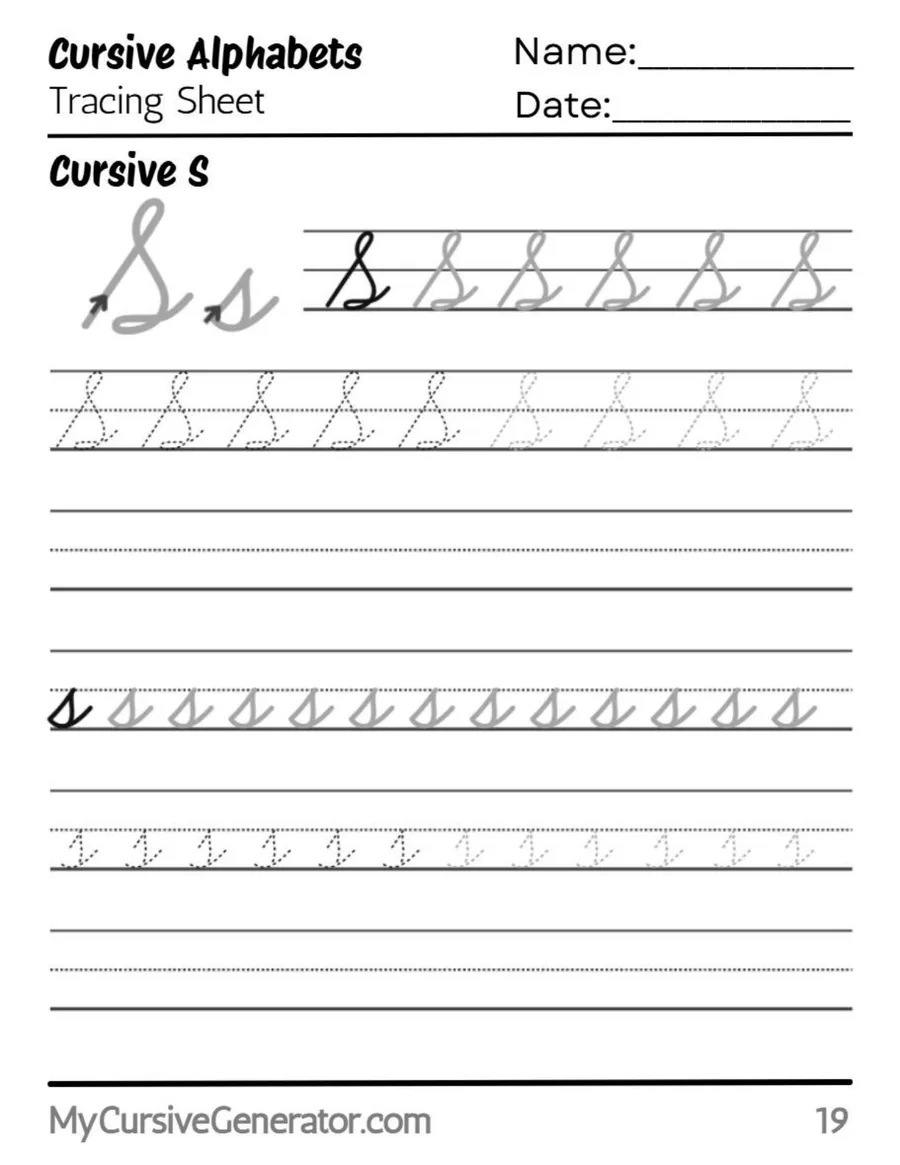
Trace the Cursive Letter S
Trace the capital S first, and watch the start. It begins at the baseline, not at the top, and sweeps up at a sharp slant to the top line. A capital S that starts at the top will look like a print S. At the top, make a tiny loop, then curve back down in a wide belly to the baseline. The bottom should form a shallow, boat like curve, not a closed loop. Trace the lowercase s next. It is tiny, between the baseline and the midline, with a pointed top, not a rounded one.
Use the worksheet in three passes: trace, copy without tracing, then write short words such as sun, sea, and sand from memory. Check the capital bottom on every attempt. If the bottom closes into a loop, the letter looks like a fancy 8. If the lowercase top rounds off, the letter looks like a small c.
The Anatomy of Cursive S
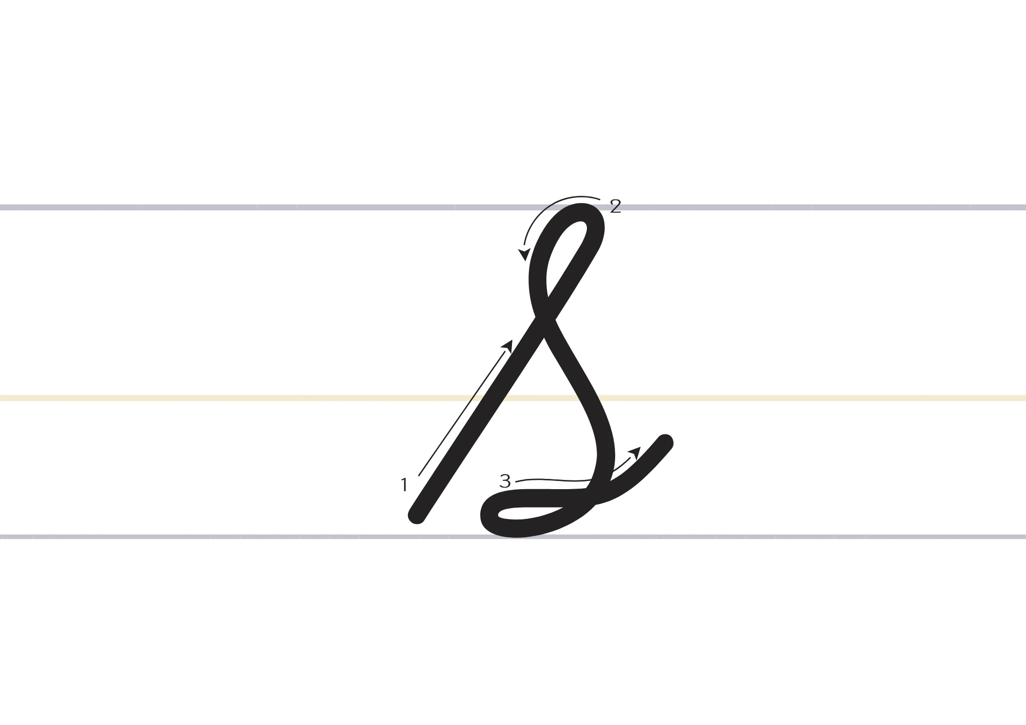
Capital S has four parts: a rising sweep, a tiny top loop, a wide belly, and a shallow bottom curve. The sweep starts at the baseline and rises at a sharp slant, about the same slant as the rest of your writing, to just below the top line. The top loop is small and delicate, much smaller than the loops of other capitals, and it turns back down into the belly. The belly is wide and open, curving left and down to the baseline. The bottom curve, sometimes called a rocker bottom or boat shape, sits on the baseline and is left open on the left, not fully closed.
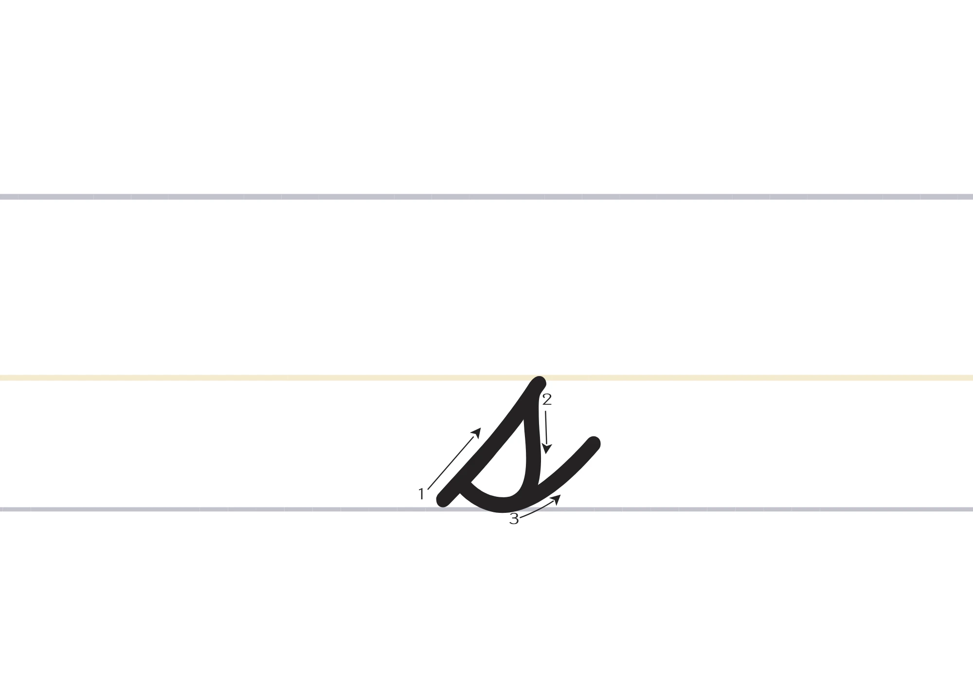
Lowercase s has three parts: a rise, a pointed top, and a fall. The rise starts at the baseline and goes up to the midline, leaning slightly right. The top is a small, pointed triangle, not a rounded loop. The fall returns down to the baseline, a little to the right of the rise, and exits to the next letter. The whole lowercase s is only x-height tall, the same height as a, c, and o. If it rises above the midline, it crowds the tall letters beside it.
Cursive S Versus Print S and Cursive C
Capital cursive S is most often confused with print S, and the test is the start. Print S starts at the top and curves down. Cursive S starts at the baseline and sweeps up. If you start at the top, you have written a print letter, not a cursive one, and it will not join well to the next letter. Practice starting every capital S from the baseline until the upward sweep feels natural.
Lowercase s is most often confused with lowercase c, and the test is the top. Lowercase c is an open curve that stops before it closes. Lowercase s rises to a point and falls back down, forming a tiny closed triangle shape. If an s looks like a c, the point was rounded off or the fall was left out. Sharpen the top, bring the fall all the way back to the baseline, and s stays distinct from c.
Before You Start
Sit with both feet flat and the paper tilted slightly to the left if you write with your right hand, and slightly to the right if you write with your left hand. Hold the pencil loosely, about two finger widths above the tip. Cursive S needs a smooth sweep and a sharp point, and a tight grip makes both wobble. Use lined paper with a clear midline, so you can see whether each lowercase s stays below it. If your paper has no midline, draw a light dotted line halfway between the top line and the baseline as a guide.
How to Write Capital Cursive S
Capital cursive S is written as one sweeping motion from the baseline to the top and back down. Keep the slant sharp, keep the top loop tiny, and keep the bottom open, not closed.
Sweep Up From the Baseline
Start at the baseline and sweep up at a sharp slant to just below the top line. Keep the slant steady and the line smooth. Do not start at the top, and do not make the sweep vertical.
Make a Tiny Loop at the Top
At the top, turn into a tiny, delicate loop, then curve back down to the left. The loop should be much smaller than the belly that follows it. A large loop at the top makes the letter look like a fancy 8.
Finish With a Wide Belly and a Boat Bottom
Curve down in a wide belly to the baseline, and finish with a shallow, boat like curve on the baseline, open on the left. Exit to the right for the next letter. Do not close the bottom into a loop.
How to Write Lowercase Cursive s
Lowercase cursive s is the form that causes most errors, because it looks simple but must stay tiny and pointed. If you write it like a small capital, it will be too large and too open.
Rise From the Baseline to the Midline
Start at the baseline and rise in a slight curve to the midline. Keep the rise short and leaning slightly right. Do not rise above the midline, and do not make the rise vertical.
Turn Sharply Into a Pointed Top
At the midline, turn sharply into a small pointed top, like the tip of a tiny triangle. Do not round the top, and do not make a loop. The point is what separates s from c.
Fall to the Baseline and Exit Right
Fall back down to the baseline, a little to the right of the rise, then exit to the right for the next letter. The fall should be a little steeper than the rise, and the exit should be short.
How to Write Cursive S: 10-Minute Daily Practice Routine
A short daily routine beats one long session. Ten focused minutes a day, for a week, is enough to make cursive S feel natural.
- Warm-up sweeps (2 minutes): draw rising sweeps from the baseline at a steady slant, then small lowercase rises to the midline.
- Capital form (2 minutes): write capital S slowly, checking that it starts at the baseline and the top loop stays tiny.
- Lowercase form (3 minutes): write small s, with a pointed top, keeping every s the same tiny height.
- Words (2 minutes): write sun, sea, and sand slowly, joining each letter without lifting the pen.
- Quick check (1 minute): compare your last row with your first. Are the points sharp? Are the bottoms open? If a row looks shaky, slow down.
Repeat the routine tomorrow. The goal is a steadier hand by the end of the week, not a perfect page on day one.
Words That Start With S in Cursive
Practice these common S words. Read them, trace them, then write them on your own:
Sun · Sea · Sand · Star · Song · Seed
Sara · Sam · Sophia · Sarah · Simon · Stella
Inside words, s is very common: fast, lesson, sister, and island all test the lowercase form. In lesson, the double s must match in height and point. In island, many writers break into print, so practice the s to l pair on its own.
Common Mistakes With Cursive S
- Starting capital S at the top. Cursive S starts at the baseline and sweeps up. A top start makes it a print S.
- Making the top loop too large. A large loop turns the capital into a fancy 8. Keep the top loop tiny.
- Closing the capital bottom into a loop. The bottom should be a shallow, open boat shape, not a closed loop.
- Rounding the lowercase top. A rounded top turns s into c. Keep the top pointed like a tiny triangle.
- Making lowercase s too large. Lowercase s is only x-height tall. If it rises above the midline, it crowds the tall letters.
- Breaking into print in words such as island. Practice the s to l join on its own until it flows, rather than switching to print midword.
How to Join S Cursive Letters
Capital S joins from its bottom curve, on the baseline, to the right. Into a vowel such as e or a, keep the exit short and level. Into a tall letter such as l, let the exit rise slightly. Capital S often needs to bridge into the next letter, so keep the bridge short and smooth.
Lowercase s joins from the baseline, to the right, after its fall. Into e, keep the connector at mid height, so the e loop does not collide with the point. Into a, exit along the baseline and rise into the oval without lifting. Into t, keep the connector short, and let the t stem rise from the baseline. Into l, as in island, practice the pair on its own, because the s point to l stem join is the one most writers break on. In every case, keep the s point sharp, or the join will look like a c join.
Why Cursive S Breaks Into Print in Fast Writing
When writers speed up, lowercase s often breaks into print for one reason: the point takes time. At slow speed, the hand has time to rise, turn sharply, and fall. At fast speed, the hand skips the turn and draws a curve, and a curve is easier to write in print than in cursive. The fix is to practice the point as a drill, not as part of a word. Write a row of tiny points, s, s, s, at a slow pace, then write the same row at a normal pace, and check that the points are still there. Once the point survives at normal speed, it will survive in words too.
How to Write S in Cursive: Practice Sentences
Single letters are only half the skill, because sentences teach spacing, rhythm, and stamina. Try each sentence three times: once very slowly, once at a normal pace, and once without stopping.
Sara sang a soft song.
The sun set over the sea.
We sat in the sand and sang.
Practice cursive s with sun, sea, and sand every day.
Read each sentence back and check the points, the bottoms, and the joins. In the first sentence, check the s in Sara first, if it starts at the baseline and the top loop is tiny, the rest usually follows.
Letter S in Cursive for Names and Signatures
For a first name that begins with S, keep the capital a little larger and more open than in ordinary writing, so it reads at a glance. The rest of the name should stay at normal size. Sara, Sam, Sophia, and Sarah all need a capital S that starts at the baseline, with a tiny top loop and an open bottom, or the name can be misread as starting with a print letter.
For signatures, the same form can be faster and looser, but it must stay recognizable: the sweep must stay slanted, the top loop must stay tiny, and the bottom must stay open. A signature S without a sweep looks like a print S, and a signature S with a closed bottom looks like an 8. Slow the signature down until the sweep and the open bottom are visible again, then build speed back up.
Cursive S in D’Nealian and Zaner-Bloser
Most US classrooms teach either D’Nealian or Zaner-Bloser cursive, and for S the difference is mainly in the slant and the top loop. D’Nealian capital S uses a sharp slant and a tiny top loop, as described on this page. Zaner-Bloser S can be a little more upright, with a top loop that sits differently. Match the model on your school worksheet, and use one model for a whole assignment, because mixing them makes the slant and the loop look inconsistent.
Cursive S, Frequently Asked Questions
What does the letter S look like in cursive?
Capital cursive S is a sweeping curve from the baseline, with a tiny top loop and a wide belly. Lowercase cursive s is a tiny pointed shape between the baseline and the midline.
Is cursive S hard to learn?
The capital is not hard, once you start at the baseline. The lowercase is harder, because the point must stay sharp and tiny. Practice the point as a drill.
How do you join cursive S to the next letter?
Capital S exits from its bottom curve on the baseline. Lowercase s exits from the baseline after its fall, to the right.
What words can I practice with cursive S?
Start with sun, sea, and sand, then star, song, and seed. Inside words, practice fast, lesson, sister, and island.
Should I learn the capital or the lowercase form first?
Start with the lowercase form. It appears in many words. The capital uses a different sweep, and it is easier once the lowercase point is steady.
Why does my letter S look like 8 or C?
If a capital S looks like 8, the top loop is too large or the bottom closed. If a lowercase s looks like C, the point was rounded off.
How do I teach cursive S to a child?
Start with the sweep for the capital and the point for the lowercase, as separate drills. Trace first, then copy, then write from memory. Keep sessions short.
What is the difference between cursive S and print S?
A print S is a smooth double curve that starts at the top. A cursive S starts at the baseline, uses a slant and a point, and hands over to the next letter.
See Your Name in Cursive
Type any name or word and convert it into beautiful cursive text you can copy anywhere, free, with no sign-up.
Open the Cursive Generator